Ross Jones - Originals and Large Giclees
Style and technique
“A moment in time” represents my first solo exhibition and has been a great journey for my style and storytelling.
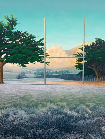
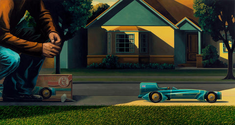
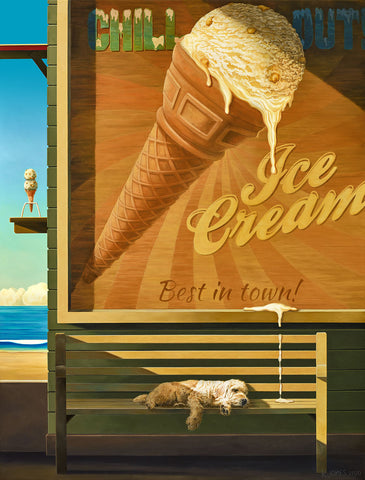
I’m drawn toward subjects that are everyday, or very special, occurrences in our lives. I prefer to convey the story by adding just enough detail to the composition that I don’t oversell the idea. I invite the viewer to complete the story – to draw their own conclusions. For example: the suitcases and boat, is it a story of arrival or departure? Therefore is it a happy or sad scene?
I’m not interested in capturing precise scenes and certainly don’t regard myself as a painter of realism. I prefer to say that I paint part truths, or more specifically, the “truth in parts”. I’m not interested in being a slave to reality.
Before I begin painting I spend many hours developing the colour palette and I’ve finally found a family of colour that brings my work to life and I enjoy working with.
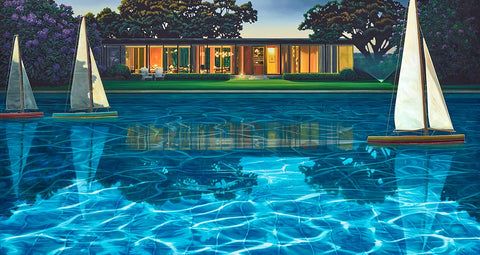
I love to distort light, stretch shadows and play with time. Light creates so much opportunity within scenes and is an important part of my paintings. It influences colour, creates mood and adds a real twist with my work. Introducing multiple sources of light is something I often work with. I also distort shapes and architecture to increase drama and create dimension within compositions.
Influences and inspirations
There have been many people who have influenced my work through the years including both artists and commercial illustrators. The list is constantly growing and evolving which I guess demonstrates the power of the internet, one evening of browsing can introduce a whole new group of favourites.
Inspirational artists include Winslow Homer, Howard Pyle, Maxfield Parish, the Wyeth Family NC, Andrew and James, and my favourites: Edward Hopper and David Hockney.
I’ve always been drawn to Maxfield Parish’s colour and composition. His paintings are fantastically decorative and the unique blending of colour demonstrates his mastery in mixing and application. “The Knave of Hearts” is one of my favourite Parish books.
Art deco architecture, designs, furniture and motifs regularly appear in my paintings – I love the clean lines from this period. I also love French poster designers for their effortless design and mastery of colour.
Closer to home I’ve always loved the works of Michael Smither, Garth Tapper, Rita Angus and Karl Maughan. The Rita Angus exhibition held at Wellington Art Gallery during the early 80’s was a huge inspiration during my late school years. I spent hours observing her drawings, sketches and watercolours. A print of one of Rita Angus’s best-loved paintings, “Boats, Island Bay, 1968” hung on my wall for many years.
Early 20th Century American illustrators have always been part of my general reading and my bookshelves are crammed with works such as “The Art of National Geographic”, “Wondrous Strange: The Wyeth Tradition” and “The Watercolours of Winslow Homer”.
I have to confess that I’m addicted to buying picture books. I have a fantastic collection of early National Geographic that are overflowing with beautiful paintings, and I especially love children’s books. While I’ve never been interested in tackling such a project, I definitely appreciate the artists who turn words into pictures and inspire the next generation of creative thinkers. They are the unsung heroes in my up bringing.